BI Reporting with a State-of-the-Art Data Intelligence Architecture
published February 5, 2022 last updated February 5, 2022
Introduction
BI technologies are rapidly evolving to include AI capabilities, such as predictive analytics, natural language queries, BI integration with applications, and AI storytelling. Hence, the language “Death of the Dashboard” [1], “Decline of the Dashboard” [2], or “Long Live the Dashboard” [3].
This article aims to describe the process of creating a BI reporting dashboard within a state-of-the-art data intelligence system. For demonstration purposes a BI reporting dashboard is developed using the M5 Walmart sales dataset [4]. The BI report is published with the Power BI Service and is available within an iFrame in Figure 1 (at the top of this article). For convenience, the dashboard can be opened in a browser window with this, Sales BI Dashbaord. Clicking or hovering over each visualization will produce drill-downs, tooltip pop-ups, and corresponding filter selections. In this case, BI reporting is designed for a store owner (or manager) and creating data insights and thus driving actionable decisions.
Creating the BI solution began with analyzing the data in a Jupyter notebook for initial exploration and data transformation, then creating a sales BI reporting dashboard using Power BI. Often, these steps are followed by data automation using ETL processes, data storage within an analytics-capable data warehouse, and visualization & reporting within a BI layer. A modern BI architecture includes AI/ML processing, intelligent applications, data governance, and data security.
The following sections further discuss the process of creating BI reporting within a state-of-the-art data intelligence system.
- Kaggle M5 Walmart Dataset
- Data Exploration and Preparation
- BI Dashboard
- Modern Data Intelligence Architecture
- Conclusions and Summary
M5 Walmart Dataset
The M5 Walmart sales dataset is chosen [4] because it’s a real data set representing a mid-size retail department store. The dataset contains 3049 sales items (unique products) across several departments corresponding to 10 Walmart stores, with five-plus years of data. There are also several online analyses and discussions available.
Data Exploration and Preparation
The first step to creating business insights is exploring the data and subsequently transforming it and extracting intelligence. A Python Jupyter notebook is often the data scientist’s go-to tool for this first step. The focus of this article will be on the BI dashboard, so we will not walk through the details of data analysis and transformations. However, the Jupyter notebook developed for this task is available on Github, m5edabi.ipynb.
For sales insights BI reporting, in concept, the data is simple, though, at first glance, it can appear complex. Only two files from the Kaggle M5 Forecast page are used:
- sell_prices.csv
- calendar.csv
In brief, the sell_prices.csv file contains daily sales transactions corresponding to years 2011 through early 2016. Each transaction includes information on the item purchased, date, store id, state, department, and the store category (food, hobbies, and household). The calendar.csv file contains information about each day, and special events, such as a sporting event, religious or national holidays, etc. In addition to the Jupyter notebook used for this excercise (link above), the data is also explored in the article published by Analytics Vidhya, M5 Forecasting Accuracy[5], though the context of the article is from the perspective of forecasting analysis.
As will be demonstrated, from these two simple files, it is possible with data analytics to derive a rich set of insights for tracking, managing, and optimizing future sales.
The output of data transformations (Jupyter Notebook) are tables that go into the BI layer. In some cases, the BI layer’s input is the result of queries into transactional databases. For our purpose, the tables (CSV files) input to the BI layer (output from the Jupyter notebook) are as follows:
- Sales.csv
- 18.55 million rows
- daily sales, one row per item sold
- Each row contains the item price, units, and revenue (units x price)
| item_id | store_id | date | units | yearweek | price | revenue |
|---|---|---|---|---|---|---|
| HOBBIES_1_008 | CA_1 | 1/29/11 | 12 | 201104 | 0.46 | 5.52 |
- ItemDeptCat.csv
- 3,049 rows (one row per unique item)
- Each row contains an item_id, store_id, and store category.
- There are three store categories - FOOD, HOUSEHOLD, HOBBIES,
- Within each store category, there are several departments
- FOODS - FOODS_1, FOODS_2, FOODS_3
- HOUSEHOLD - HOUSEHOLD_1, HOUSEHOLD_2
- HOBBIES - HOBBIES_1, HOBBIES_2
| item_id | dept_id | cat_id |
|---|---|---|
| FOODS_1_001 | FOODS_1 | FOODS |
- StoreState.csv
- 11 rows
- Hierarchy of store, to state, to country
| state_id | store_id | country | state |
|---|---|---|---|
| CA | CA_1 | United States | California |
- cal_events_summary.csv
- 7,557 rows
- one row per date, for dates with at least one event
- a count of each type of event per store_id
- this table is useful for supporting a calendar visual
| date | state | store_id | Cultural | National | Religious | SNAP | Sporting |
|---|---|---|---|---|---|---|---|
| 2/1/11 | California | CA_1 | 0 | 0 | 0 | 1 | 0 |
- cal_events_detail.csv
- 7,557 rows
- One row per event
| date | event_name | event_type | state | store_id |
|---|---|---|---|---|
| 2/6/11 | SuperBowl | Sporting | California | CA_1 |
The data model often employed by BI technologies is known as a “star schema,” in contrast to a single flat (wide) table, which is typicaly used for ML modeling. There are at least two significant reasons for this difference. The first reason is the star schema, consisting of a normalized set of data tables, and is significantly more memory efficient than a single flat table. Second, the Star Schema model contains two types of tables, Fact tables (e.g., Sales.csv, cal_events_details, cal_events_summary) and Dimension tables (e.g., ItemDeptCat, StoreState), which enable the BI technology to efficiently aggregate, filter, and execute drill-down operations.
In this case, a single wide (i.e., flat) table containing all the columns, equivalent to the above 5 tables, requires 58 million rows, with 20 columns, and a memory footprint (disk) of 8.7 GB, which is about 10x the star schema footprint. In contrast, the largest table above (star schema configuration) is Sales.csv with 18.5 million rows, 7 columns, and a memory footprint (disk) of 917 MB. The next largest table, cal_events_detail, is 8,171 rows with a memory footprint (disk) of 341.5 KB.
BI Dashboard
Designing a BI reporting dashboard requires a combination of business domain knowledge and technical expertise. This dashboard was designed to provide sales insights targeted to a retail store manager/owner. An excellent tutorial for developing such a Power BI tutorial is found at the following link Comparative Analysis Dashboard in Power BI [6]. The tutorial is an excellent introduction to Power BI and provides instructions for how to build a report similar to the one displayed above.
In the BI Visualizations overview below, each visual is described with corresponding business insights. Static screenshots are displayed in the supporting figures. These figures are reproducible in the live dashboard above (Figure 1). Next, for the benefit of the data professional, an overview of the BI Data Model is presented.
BI Visualizations

Year Selection - begin by selecting the year of interest with the year selector widget. If no year is specified, the entire dashboard defaults to the last year (2016). Since the final year (2016) is a partial year, selecting it will result in poor performance for CY (Current Year) vs. (Previous Year) metrics. Similarly, 2011 is a partial year, so 2012 will show correspondingly larger YOY (Year on Year) Sales metrics.
Card Visuals - card visuals along the top correspond to CY (Current Year) Sales, BY (Budgeted Year) Sales, PY (Previous Year) Sales. The BY sales target is set to 10% above PY sales, based on the initial data exploratory analysis. Budgeted variance is, by definition, (CY - BY) / BY, stated in percentage.
YOY Sales % and YOY Unit Sales % data color are green if greater than 0.1, yellow if less than 0.1 and greater than or equal to 0, and red if less than 0.
BY sales is positive (YoY sales ≥ 10%) in all years except 2014, where we see a negative 4.17% budget variance. Interestingly, in 2014 we see unit sales slightly down (YOY Unit Sales = -0.35%); however, YoY Sales is still positive (+5.41%). This is a clue that prices have risen.
Revenue by Category - is displayed with a doughnut chart visual, where we see FOODS has by far the largest revenue (i.e., Sales) of the three store categories, with greater than 50% of sales, followed by HOUSEHOLD with about 30% of sales, and HOBBIES with less than 15% of sales, throughout all years. Hovering the cursor over any doughnut categories will pop up a tooltip illustrating the sales for each department within the category (Figure 3).
CY Sales vs. YoY Sales % bubble chart - indicates revenue strength vs. revenue growth. The visualization provides a drill-down capability from the store category level to the department level. Drill mode is turned on by clicking the down arrow visible while hovering over the visual. In 2014, we Foods has the strongest revenue and YOY revenue growth (i.e., top right). Drill down by clicking on FOODS to drill into the FOOD category, and you will see Food 1, 2, 3 in the visual. Foods 3 strongly dominates both revenue and revenue growth. Further understanding why Food 3 has strong revenue and revenue growth may provide insights for further optimizing sales.
Hovering over any datapoint bubble will pop up a tooltip illustrating monthly sales, as seen in Figure 3. In this case, for the FOOD category in 2014, we notice that sales growth is positive all year, though growth starts slow early in the year (Jan and February), then picks up significantly, hits a low in September, and then ends with solid growth the last three months of the year. The bubble color is yellow for any category with YoY Sales % of 0 to 5%, green for greater than 5%, and red for YoY Sales % less than 0.
Sales Revenue bar chart - illustrates sales by state, where we see that California has significantly more sales than Texas and Wisconsin. This visual offers the ability to go up one level of hierarchy (National) or drill down into the stores corresponding to the state. Remember to turn on drill mode by clicking the corresponding down arrow in the visual. A tooltip pops up when hovering over any state (Figure 3). We see that California has three stores, while Texas and Wisconsin have two stores, which explains why sales are higher in California. Like the previous visual, a bar is yellow for YOY Sales % is between 0 and 5%, green for YOY Sales % greater than 5%, and red for negative YOY Sales %. Turn off drill-down mode, and click on Texas, and we see that YOY sale is 3.51% (YOY Sales % Card); thus sales bar chart is colored yellow (i.e., greater than 0 and less than 5%).

Sales Revenue Trend with Forecast - sales revenue trend is shown in the Sales Trend with Forecast line chart (Figure 4). We observe an upward revenue trend over time. In general, it’s good for a business to have growing revenue over time; however, we do not have product costs in this dataset, so it is not possible to assess profits. We observe that each year there are zero sales on December 25, corresponding to the one day of the year that Walmart is closed for business.
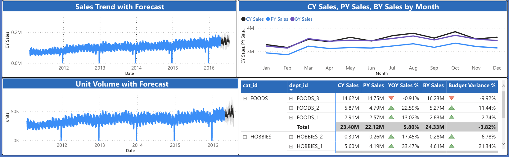

The visual also includes a forecast for six months into the future based on the built-in Power BI forecasting methods. In this case, the forecasting methodology is based on the Holtz-Winters forecasting algorithm [7]. The seasonality is set to 365 days (1-year), with 90% confidence indicated in light grey. The algorithm forecasts one observation variable into the future (univariate) and is thus limited to simple forecasting scenarios. Nevertheless, it is useful to see the forward projection of sales revenue for 6-months into the future.
Unit Volume Trend with Forecast - similar to the previous case, unit sales trend are visualized in the Unit Volume with Forecast chart (bottom left). Comparing the unit level performance with sales revenue yields some insights. For example, selecting the HOBBIES category (click on HOBBIES, orange, within the Revenue by Category doughnut) shows that unit volume declined in 2014 while sales revenue increased, perhaps due to an increase in prices. This will be confirmed on page 2 of the BI report. Also, for the HOBBIES category, unit sales increased early in 2013. For most years, we see revenue growing faster than unit sales.
Like the previous one, this chart also includes a 6-month forward-looking forecast. It is worth noting that unit volume forecasting accuracy is the objective of the Kaggle competition, for which M5 Walmart data is published [4]. In this case (as discussed previously), the forecasting employs a classic univariate forecasting methodology (Holtz-Winters), which will not give the accuracy for individual items as the more sophisticated methods submitted to the Kaggle competition. The objective here is data insights and exploration within a sales revenue and business context. A unit-level forecasting method is beneficial for inventory management and other related insights.
CY Sales, PY Sales, BY Sales by Month Line Chart - shows the monthly sales trend. As before, we can select the specific year of interest. Looking at 2014, we see CY (Current Year) sales growth for each month, but most of the year, monthly (CY) sales are below BY (Budgeted Sales). At the end of the year, November and December, CY (Current Year) meet and exceeds BY (Budgeted Sales). As before, selecting the HOBBIES category shows that CY Sales is below PY (Previous Year) Sales for most of the year. In the Bubble Chart, we can also see that for 2014, the Hobbies bubble is in the lower-left corner. Therefore, in 2014 it appears that HOBBIES is a drag on sales growth. However, we also see that in 2015 the situation changed, and the Hobbies bubble has YOY sales growth greater than 30%.
CY Sales, PY Sales, BY Sales by Month Matrix - The month matrix (table with drill-down) on the lower right lists the Sales store category and department. Hovering over any row will trigger a tool-tip illustrating YOY sales by month. This visual is helpful to explore specific numbers corresponding to the visuals.
Trends - Revenue, Units, Prices - the trends page (page 2) of the BI report is accessed by clicking the arrow on the bottom to get to the second page. Here we see an exploded view of the line charts. Selecting the HOBBIES category on the left shows that the prices for hobbies increased significantly from 2012 to 2013 then went through various changes in 2014. This observation explains why the YOY unit volume decreased in 2014 relative to 2013 while still showing a sales revenue increase of 5.41%. Selecting any year illustrates a weekly seasonality for revenue and unit sales.

Sales Event Calendar - Page 3 of the BI report illustrates the sales event calendar visual and a tabular calendar listing. Click on arrow on the arrow at the bottom of the report to get to page 3. The calendar is a little slow to render since it is based on a Javascript rendering over multiple years. The calendar visual is imported from the Power BI marketplace (“AppSource”), Akvelon Custom Calendar [9]. Events in the calendar include holidays, SNAP (food stamp days), sporting events, and holidays. These events are helpful to know events that affect sales. Such events will help create a more accurate demand forecast. Clicking on specific days and events in the calendar will filter the corresponding table to display only the corresponding selection.

BI Data Model

The data model, shown in Figure 9, is important for dashboard performance (aggregations and filtering) and for managing the data footprint (in-memory and disk). The data is loaded within the Power BI memory and as previously noted follows a Star Schema model. For large datasets that do not fit within the Power BI memory, the data model will exist in a data warehouse, also in a Star Schema format.
The data model tables are summarized below.
- Sales (Fact Table) - item_id, store_id, price, revenue. This is the main Fact Table underlying page 1, page 2, and tool-tips.
- ItemDeptCat (Dimension Table) - cat_id, dept_id, item_id. relationship between store category, department, and items.
- StoreState (Dimension table) - country, state, state_id. dimension table with the relationship between stores, states, and country.
- DimDates (Dimension Table) - Date, Month, Month_Number, Quarter, Year. Dates dimension table connected to all Fact Tables.
- cal_events_detail (Fact Table) - date, event_name, event_type, state, store_id. This table is listed on page 3, the calendar page.
- cal_events_summary (Fact Table) - data, Cultural, National, Religious, SNAP, Sporting, state, store_id. This table displays the sum of each type of event in the calendar visual (page 3).
Modern Data Intelligence System
After the data exploration and creation of the BI reporting dashboard. The next step is data automation and integration into a data-intelligence system. The BI report is thus published into the BI reporting layer, data transformations are automated with ETL, and data is stored within an enterprise data warehouse.

A state-of-the-art data intelligence architecture is depicted in figure 10, and is similar to those described in recent publications, such as in [10]. In this article, salient architectural tenants are identified; however, each topic could easily become an entire article. Often BI reporting is described in isolation of other data systems. The reality is that there are legacy data systems in most established businesses (not born digital). Understanding how the analytics intelligence system works and delivers intelligence within this broader context is of prime importance. Data intelligence sources and functionality extends across the ecosystem, including intelligence at the edge, IoT devices, and data security and privacy. A significant capability of the modern data intelligence architecture is for connectivity and transformation of data from data sources across the ecosystem, including legacy data systems and business functions.
The following are the primary tenants of a state-of-the-art data intelligence architecture (Figure 10).
- ETL processes and connectors import data from across the enterprise data eco-system into the enterprise data warehouse. Data processing includes both batch and stream processing. Specific ETL technology technologies include, for example - Spark, Flask, AWS Glue, Azure Data Factory, GCP Dataflow, and Matillion.
- An Enterprise Data Warehouse serves as both large-scale storage and analytics processing engine. Examples of data warehouse technologies include Delta Lake, Snowflake, AWS Redshift, GCP Big Query, and Azure SQL Data Warehouse.
- Governance, privacy, and security best practices are essential to meet regulatory requirements for ensuring the privacy and security of consumer data, such as GDPR.
- An architecture for organization and management of data partitioning across business silos. Recent approaches and best practices often require some form of multi-tenant patterns [11,12] and inter-business Data Mesh [13].
- Business-specific intelligent algorithms enhance business value in revenue enhancement and cost-efficiency. Algorithms take the form of predictive analytics, Natural Language, and Computer Vision.
- A BI reporting layer provides business KPI tracking interactive reports, visualizations, dashboards, and alerting. Technologies for BI reporting include Tableau, Power BI, Looker, GCP Data Studio, and AWS QuickSight.
- Operationalization of Intelligence is often realized by integrating intelligence into application behavior and data collection. Most BI technologies offer embedded BI integration capabilities. For example, Power BI provides integration with Power Apps. Data Studio, Tableau, and QuickSight offer the ability to embed BI reports into web and mobile applications.
The choice of the specific technologies in the data insights system considers business goals and technical tradeoffs. For example, the choice of a cloud provider will often drive the selection of the technologies, or in other cases cloud-agnostic technologies may be chosen.
Conclusions and Summary
Achieving value and scaling data intelligence to enterprise-scale requires first exploring and transforming data into actionable intelligence, followed by automation into a data intelligence system. This article demonstrated the first step by developing a BI report beginning with a realistic retail sales dataset. Next, a state-of-the-art data intelligence system was described wherein the BI reporting is automated and integrated for enterprise business consumption.
The creation of the BI reporting dashboard began with the M5 forecasting dataset from Kaggle. The dataset contains daily sales of 3049 products for 5.25 years, three states, and ten stores. The data is first explored with a Jupyter Python notebook and transformed into a set of data tables in the form of a star schema, which is then input into a Power BI dashboard. Next, KPIs and visualizations that drive actionable insights for the business user are created. The BI dashboard developed here is suitable for monitoring, tracking, and gaining insights for optimizing future sales. The BI reporting dashboard contains three reporting pages - 1) Sales BI Reporting, 2) Trends - revenue, units, prices, and 3) event calendar.
The dashboard will require regular updating, perhaps daily or semi real-time. Thus, the next step is the automation of insights and operationalizing intelligence into business systems. A State-of-art data intelligence system was described (figure 10). The functionality of a state-of-the-art data intelligence system is often similar across enterprises but will differ in the technology choices. The system will include capabilities such as - connectors to data across the business functions and business silos, ETL processing, enterprise data warehouse, data governance, end-to-end data privacy and security, AI analytics processing, BI layer, and intelligent business applications and systems.
Though not demonstrated in this article, a next step is to develop specific predictive AI capabilities that provide business value. In this case, retail sales, AI-based insights, for example, could include multi-variate item level demand forecasting (such as that in the M5 Kaggle competition), product item clusters, optimized pricing algorithms, and profitability optimization.
References
-
Thoughtspot, Death of the Dashboard (ebook), https://media.thoughtspot.com/pdf/ThoughtSpot-Dashboards-are-Dead.pdf, 2020
-
Gartner, Top 10 Trends in Data Analytics (Decline of the Dashboard) https://www.gartner.com/smarterwithgartner/gartner-top-10-trends-in-data-and-analytics-for-2020, October, 2018
-
J. Fisher, Qlik, The Dashboard is Dead - Long Live the Dashboard. https://www.qlik.com/blog/the-dashboard-is-dead-long-live-the-dashboard, March 2021.
-
Kaggle, M5 Forecasting - Accuracy, https://www.kaggle.com/c/m5-forecasting-accuracy, December 2019
-
Aakash V, Analytics Vidhya, M5 Forecasting Accuracy: Time-Series Forecasting Accuracy using Walmart Sales Data, https://medium.com/analytics-vidhya/m5-forecasting-accuracy-time-series-forecasting-using-walmart-sales-data-374765d3f1f7, July 2020
-
PK, Comparative Analysis Dashboard in Power BI (Tutorial), https://www.youtube.com/watch?v=X7DsnK5bD-0,
-
Power BI Forecasting, https://powerbi.microsoft.com/es-es/blog/describing-the-forecasting-models-in-power-view/#ETSAAA, Accessed December 2021.
-
Kwon Lee, Modern BI Primer, One.Six, https://www.onesixsolutions.com/blog/tableau/a-modern-bi-primer-and-why-less-is-more/, Accessed Dec 2021.
-
Akvelon, Custom Calendar by Akvelon, https://appsource.microsoft.com/en-us/product/power-bi-visuals/wa104381179?tab=overview
-
Deloitte, Modern Business Intelligence: the path to big data, https://www2.deloitte.com/content/dam/Deloitte/tr/Documents/deloitte-analytics/Modern%20Business%20Intelligence.pdf, April 2018
-
Microsoft-Azure, Multi-tenant SaaS Database Tenancy Patterns, https://docs.microsoft.com/en-us/azure/azure-sql/database/saas-tenancy-app-design-patterns
-
Snowflake, Design Patterns for Building Multi-tenant Applications on Snowflake, https://developers.snowflake.com/wp-content/uploads/2021/05/Design-Patterns-for-Building-Multi-Tenant-Applications-on-Snowflake.pdf
-
Z. Dehghani, Data Mesh Principles, https://martinfowler.com/articles/data-mesh-principles.html, December 2020.